There has been a bit of an issue - without my knowledge - someone has booked the photography shooting studio next Wednesday morning for an observed teaching exercise for teir PCG certificate - this messes up an important session with the Photography group.
I've had a chat with John - and there is a solution.
Next Wednesday - swap around - so the group that was with John today are with Hannah on the narrative illustration brief - and the group with Hanna have their first session with John - he will give you a talk and show in the studio - and then take you into the shooting studio after lunch.
This way - you all get an extra week to work on your projects, and nobody misses any time and the disruption does not bother anyone - does that make sense??
Wednesday 27th - group 1 - John, group 2 - Hannah
Wednesday 47th - group 2 - John, group 1 - Hannah
Wednesday 11th - group 1 - John, group 2 - Hannah
Wednesday 18th - group 2 - John, group 1 - Hannah

Wednesday, 27 April 2011
Tuesday, 26 April 2011
D&AD winner
David McG from Top Up is a winner in the D&AD awards, we don't know which prize he has won until the night - but here are the full list of winning entries and a link to his work.
Monday, 25 April 2011
Tuesday 26th.
FDA2 - 10 am please - for a talk about FMP, the rest of the year and the competition briefs.
FDA1 - Gray Neill at 10am for the penultimate C&C - I will give you all a detailed printed timetable for the test if the year in the afternoon.
Please don't be late.
FDA1 - Gray Neill at 10am for the penultimate C&C - I will give you all a detailed printed timetable for the test if the year in the afternoon.
Please don't be late.
Sunday, 24 April 2011
FDA1 - Wednesday 27th April Photography, note from John Reynolds
You will need to purchase some photographic paper to complete this project - shop around - it may be cheaper to buy in bulk if you want to get together, and John also says -
"we'll make paper negs using photographic paper in the 4x5 camera, which they can then scan and invert in photoshop - a nice combo of Traditional and Digital, so they will definitely need some b+w photographic paper - available from Jessops, Marriots on the seafront or the college shop.
If they can get it in 4"x5" size then brilliant if not they'll need to cut it down a (10 x 8 quartered) in the dark room - I can show them how.
If you have the chance - get hold of some 4 x 5 Direct Positive paper - approx £12 for 25 sheets, less faffing about than making paper negatives"
Michael Rolph
Website here of the photographer Michael Rolph who creates stunningly beautiful images from some of the most mundane things, including plastic bags and blank signs - and finds wonder in some of our less attractive urban landscapes... Stevenage in particular.


Showcase:John Burgess
This is the website of a 21 year old design student at De Montford University - really lovely work, well presented and finished, lots of attention to detail and plenty of imagination - well controlled and beautifully rendered. He's been able to demonstrate a range of valuable skills and shown thoughtful consideration as well as playfulness and imagination. There are plenty of self initiated and freelance projects, as well as tasks that are very similar to the briefs that you are given.
This is the level that you are all expected to achieve - and remember - there are literally thousands of design students leaving college every year and entering a very competitive industry - there is no room passengers.

This is the level that you are all expected to achieve - and remember - there are literally thousands of design students leaving college every year and entering a very competitive industry - there is no room passengers.

Studio Brave
Very nice work here via September Industry from Studio Brave - lots of strong colour and very disciplined typography.


Australian Design
Fantastic archive website here - really interesting work and good design reference on Re:Collection.


Wednesday, 20 April 2011
FDA1 Photography tips.

(found photo that I've had on my hard drive for some time - if anyone can identify it - I'd be grateful )
Next week - FDA1 will have a photography course with John Reynolds, and also optional evening classes with Charlotte.
As a bit of preparation - here are some links for you that John put together - make yourself familiar with them, you will need to know who they are and what they do.
Joel Peter Witkin - Very good link here
Murdo Macleod - Really good portraiture - very appropriate for brief
Rineke Dijstra - Link to Tate Collection reference
Jane Bown - personally my favourite woman photographer of the last centuary
Annie Leibovitz - not my favourite - but highly skilled
Richard Avedon - One of the greats
Sam Taylor Wood - again, not my favourite - but this is very appropriate to brief
Diane Arbus -Another of the greats
- and a couple from me
Angus McBean - one of my heroes
Terrence Donovan
Terry O'neill
David Bailey
Martin Parr
Tuesday, 19 April 2011
Monday, 18 April 2011
T Shirt Packaging
Ugly graphics and not 100% successful - but interesting idea - making the hanger part of the product display and advertising.


Robin / Lucienne day in Chichester
Robin and Lucienne Day brought a radically modern aesthetic to British design in the 1940s. After a career spanning 60 years they remain a reference point for many designers working today.
A new exhibition of their work runs until the end of June 2011, at the Pallant House Gallery, Chichester. Simon Martin, the head of curatorial services at the the gallery, gives an insight into the couple's work.
Film here.

A new exhibition of their work runs until the end of June 2011, at the Pallant House Gallery, Chichester. Simon Martin, the head of curatorial services at the the gallery, gives an insight into the couple's work.
Film here.

Friday, 15 April 2011
Vintage by Hemingway
Interesting article here about the latest print collection from Wayne Hemingway - looks very much like the search for the next 'Keep Calm' - this one is my favourite. Some parallels with the Tea Towel project we have already completed.
I had a quick meeting with Rose Radcliffe from Butlers today and she is very keen to get involved next year and set a brief for both years - good news.

I had a quick meeting with Rose Radcliffe from Butlers today and she is very keen to get involved next year and set a brief for both years - good news.

Thursday, 14 April 2011


Country Line Packaging
I did a really similar job to this a few years ago, and I really like what they have done here with a simple wood-block motif - very appropriate for the project / medium.


Wednesday, 13 April 2011

Seed Bombs
Nice work here, Seed Bombs are increasingly popular and have been in the papers a few times recently - small balls of fertilizer and random seeds that are thrown into unloved or abandoned spaces to spread a better bioculture - popular with eco activists and gardeners alike.


Leeds University Publicity Material
Some nice work here - relevant to students considering the H.E. brochure and the publicity for the shows.


Cartlidge Levine
CL have been around almost as long as I have, but have always produces exceptionally intelligent and refined design and communication graphics. There is a nice showcase here on the September Industry website - and their main site is here. CL are one of the most important design consultancies working in the UK today and you really need to be aware of what they are doing.


Tuesday, 12 April 2011


Successful Professional Practice work
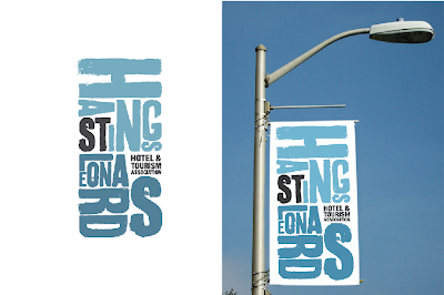
Well done to Top-Up Jon, he did some really great PP work for an external client through the department and they are delighted with the work - and it's going forward. Jobs like this are notoriously difficult - with clients not really knowing what they want and a 40 member association all with different ideas and needs - but they loved this , the concept brings Hastings and St Leonards' together - and suggests the sea, the sky - and one of the iconic net huts.
The brief also included print items, stationary and a website.
The brief also included print items, stationary and a website.

Roberto de Vicq de Cumptich
This is probably some of the best work I've found online in a couple of years - and very relevant to all of you. I'm not a huge fan of the navigation on the website - you need to use your head to find your way about... but that's all part of the intrigue. Includes the wonderful Bembo Zoo and Words at Play.


Monday, 11 April 2011
LIve paint in Photoshop for ipad
Interesting video here showing how far PS has come - specifically towards the ipad, with live paint and mix effects and hand gestures.
Detailed timetable for next term - FDA2
You start on April 26th ( April 25th and May 02 are both bank holidays ). At this point, as already discussed, the only days you are being taught by someone except me are
Tuesday May 3rd - Gary Neil - final C&C
Wednesday May 4th - Andrew Robey
Wednesday May 11th - Andrew Robey
( Andrew is actually in hospital at the moment... bitten by a snake! but should be OK by the time we get back )
You have the opportunity to request any staff member - depending on the work you have developed for your FMP, so be prepared.
On Tuesday April 26th - you will have a session with me talking through the competition work - and you must hand over the detailed rational for your FMP, and be ready to talk it through - we start at 10am, I will confirm the room - I don't want to be talking at the same time that Gary Neill is teaching FDA2. We also need to start planning the end of the year, the show etc and any other business, such as publicity.
Detailed timetable for next term - FDA1
This is quite a short term - you are not being taught by me directly, but I will be spending time with each of you in tutorial, going through the year and all your work and preparing for next year.
You have loads to do this term - so managing your time is essential - but there is plenty of fun stuff along the way. This timetable will also be linked over on the right for easy reference.
All the work this term is practical and creative - and all based on 'Frankenstein'. You are not timetabled on paper ( as yet ) for after half term - but you will be asked to attend on a couple of days early on - this will include giving a presentation - so don't 'vanish'.
Monday April 25th is a bank holiday, so college is closed.
Tuesday 26th - FDA1 - Gary Neil / Critical and Cultural Studies ( main studio )
Wednesday 27th - FDA1 - Hannah Rollings / John Reynolds
This double project will continue for 4 weeks, I'll split you into half and one group will work with Hannah - with an illustration brief - the other group will work with John on a photographic brief ( mornings and afternoons )
................................................................................................
Monday May 2nd is also a bank holiday, so college is closed again.
Tuesday May 3rd - Printmaking ( Silkscreen ) with Myles Calvert
Again - as there are 16 of you - I'll split this into two groups - week 1 will include induction to the workshops.
Wednesday May 4th - Hannah Rollings / John Reynolds
................................................................................................
Monday May 09th - Peter Quinnell
This is a 3 week brief for the whole group
Evening class - Charlotte Lambert Gorwyn will be working with you from 5pm - 7.30 pm in the dark room and studio. This is a timetabled class and very important, it's ideal to do this in the evening as the studio and all the facilities will be free.
Tuesday May 10th - Myles Calvert
Wednesday May 11th - Hannah / John
................................................................................................
Monday May 16th - Peter / Charlotte
Tuesday May 17th - Myles Calvert
Wednesday May 18th - Hannah / John
................................................................................................
Monday May 23rd - Peter / Charlotte
Tuesday May 24th - Myles Calvert
Wednesday May 25th - Gary Neil - Cultural and Critical Studies ( Main Studio - final session )
Nice work!
I really like this project for 'Fast Eddie's Barbers' - it's very 'complete' and well thought through. This would make a good example of a Final Major Project - well designed, covers all the bases and very thorough - commercial but creative at the same time. It's designed by Richard Arthur Smith and his portfolio is available via the Behance network here.
He also designed a great set of Edgar Allan Poe book covers - we did modern gothics last year with the previous FDA2 and I set a couple of Poe covers. These are great. This is a personal Project - even when you are working you should still be doing creative work outside your practice to keep your eye sharp.


He also designed a great set of Edgar Allan Poe book covers - we did modern gothics last year with the previous FDA2 and I set a couple of Poe covers. These are great. This is a personal Project - even when you are working you should still be doing creative work outside your practice to keep your eye sharp.


Sunday, 10 April 2011
Brilliant Work!

I LOVE this project for EF Language schools - very simple, well executed films with fantastic interperative typography, the London one is really strong - it's essentially the same exercise that FDA1 have already undertaken - expressing a sense of place by using selective typographic statements really good stuff. The Bejing film is here - it's interesting to see the stylistic range of Chinese pictogram typography too.
New Wordpress Theme
Nice, clean design here for a new style word press theme - suit anyone looking for a more formal 'graphic design' look.


Party Invitation
FRIDAY 15 APRIL
John Cage Season opening party
You are invited to the opening party for our incredible John Cage season. Featuring taster performances by Margaret Leng Tan and Felix Thorn and his 'Machines'. 6pm onwards.
RSVP to sally.ann.lycett@dlwp.com to assist with numbers or just turn up.
John Cage Season opening party
You are invited to the opening party for our incredible John Cage season. Featuring taster performances by Margaret Leng Tan and Felix Thorn and his 'Machines'. 6pm onwards.
RSVP to sally.ann.lycett@dlwp.com to assist with numbers or just turn up.
Showcase:Shaz Madani
Really nice work here from this young London based designer - his design work for Top Shop has really opened up the way the brand communicates. I'm a big fan of this clever woodblock poster, and the sentiment behind it.


DesignWorkLife
I've flagged up this reference and archive site before - it has some of the best work in the world presented to you in one place, and is easy to use and very inspirational. I spent about 20 mins today working my way through some recent pages and fond work that corresponded in some way to almost everything that FDA1 and 2 have done in the last couple of years.
This post about Penguin Essentials demonstrates how tp achieve really great results in book vover design when you are required to create the text material yourself, rather than 'set' it - just as FDA2 were asked to do, this year and last.
I really like this decorative new display font that corresponds to several briefs and demonstrates how it can be used commercially.
This work from Sam Dallyn is a great reminder that even the most simple task benefits creativity ad a bit of humour.


This card concept is a clever new way to make something fresh from a familiar idea.

I also found quite a few commercial and retail projects - such as the bags, tea towels and a lot of coffee shop projects, some by students, some professionals. It's really important to research thoroughly before you start creative work I've gone on and on about this over the last couple of years and that's why I always insist on presentation of research boards, creative concepts and development. Looking around and seeing what other designers are doing isn't an opportunity to copy, but a chance to see what's possible and raise your own game.
Saturday, 9 April 2011
Penguin Books
From the Penguin Blog, video interviews with designers Richard Bravery, Andrew Smith and Jenny Lord - plus a chance to win the complete Penguin Great Food collection.


Friday, 8 April 2011
Job Opportunity
Lighthouse Communications Internship
Deadline for applications: Monday 18 April 2011, 9am
Lighthouse is looking for an enthusiastic individual with a passion for communication and social media, and a keen interest in working in the arts, to join our team for a 12-month training opportunity. This is a fantastic opportunity to gain experience in communications and marketing within a vibrant digital arts organisation. Through training, mentoring and professional development, you will gain key skills and contacts, empowering you to progress into a rewarding and stimulating career.
The internship is part of the Permeate scheme, which seeks to address under representation of people from diverse backgrounds within the visual arts workforce, therefore we are looking for an individual from a Black, Asian or Minority Ethnic (BAME) background.
Bursary £16,000 pro-rata
Supported by Arts Council England, as part of Permeate
For more information and how to apply please download the brief and application form here
Rumbled.....
I just stumbled across this, if any of FDA1 have thought hard enough - you will already have figured out what you are doing in silkscreen next term... it's pretty close to this from Ryan Frease...


Turner Contemporary
Opening in 7 days - it's easy to get to Margate - less than 50 mins from Ashford, only 50 miles by car. The gfirst few weeks will be free, and there is a fairly full program of events - all the details are here.
Might give you an idea of what to expect next year when the Jerwood Opens.

Might give you an idea of what to expect next year when the Jerwood Opens.


Essential Works - Refectory & Coffee Bar Easter Closure
We are planning to close both the Refectory and Coffee Bar over the Easter break for major essential works to replace the concrete floor that has been found to be defective by the main building contractor. We are expecting some noise disruption from Monday 11-Apr to Wednesday 13-Apr-11 whilst the floor is broken out and limited access next to the outside seating area where the contractors will be working from throughout this period..
There will a limited temporary catering service provided from the adjacent Grab & Go area throughout the closure period where we will aim to provide a daily choice of soup and at least one hot dish plus sandwiches, paninis, cakes and other snacks as normal plus a full Costa service with a choice of cold drinks.
The Refectory and Coffee Bar will close at 5pm on Friday 8-Apr-11 and is planned to reopen at 08:30 on Tuesday 2-May-11; the temporary catering service will be available throughout this period.
Please Can everyone bear with us and particularly the catering staff during this difficult period so we can get back to normal and refit the area as soon as possible for everyone's benefit.
Letterpress Workshops at St Brides
They are quite expensive, and based in London ( even with the student discount ) but the evening classes are more manageable and much cheaper - details here.
Time To Change
I contacted Time To Change ( I've already posed about this campaign ) and told them I liked their graphics - and they were kind enough to send over a big box of well designed goodies - including T Shirts, posters, postcards, beer mats and cotton shoppers - they are in the office if anyone would like to help themselves.
Their facebook page also has this new Flash animation that brings the typo to life.

Their facebook page also has this new Flash animation that brings the typo to life.

Putting up the 2011 Shows
We had a meeting yesterday about the shows - I don't know if FDA2 remember much from last year, you were not really involved, but here is advance warning of what you need to do. There is quite a lot to get through in the last few weeks - so make sure that you don't leave you work to the last moment, you MUST be involved in putting the show up and pulling your weight, it does not happen by magic, not does Richard the technician do it all.
You will be showing in your own room - SP4110 - by far the best space for this event, but because of all the light and space, the standard of finish must be very high.
Boards
They have been ordered ( 28, 4 x 8 ) - Richard will be cutting them down to take off enough to clear the lighting and then delivering them to the room - they will need to be put together into two large bulkheads ( already designed ) and then painted - I need the boys to help with construction and the girls to be around to paint - it's not me being sexist, but they are very heavy and I need quite a few of you at the same time to put everything together.
All the furniture needs to be either stacked inside the bulkheads or moved to the 5th floor - this will take a day. All the computers will be moved to the Illustration studio - only a handful will be networked, so don't assume you can come in and work.
We need to pay for materials and equipment, last year everyone put £15 into the pot. We had a bar on the PV night and the profits were divided up by me and everyone made a profit. If we are having a bar, we need a rota and you must apply for a licence through Ali. You also need to buy beer and plastic glasses ( last year Foundation went to France and we had beer brought back from Belgium, we got everything else from ESK ) We are already planning a large bar in the area outside the back lifts - a small bar in our Hall / Reception area off the main corridor would work well - you need to decide what you want to do.
The show needs to be manned all the time - so a rota will have to be put together and EVERYONE must do a stint ( in pairs )
Publicity.
It's an awkward issue - there are so many departments with different ideas about what to do and almost no money to get anything printed. It's been suggested that each department put an idea forward - and I've also said that anyone in Graphics can put a concept together too ( it's your show - if you don't bother - then you can't complain if you don't like it - you future is at stake so get organised and design something )
This whole process starts at the beginning of June - you must have your work out of the way and be getting ready to print and mount. Putting up the show takes a lot longer than you expect.
Thursday, 7 April 2011
Showcase:Parallax
Very interesting Australian studio - the site is a bit slow to load ( might just be my rubbish broadband connection ) but the work is lovely - I like this example that should indicate to FDA1 who are looking for decorative fonts over the break - that not everything has to be obvious.
(If you are sharp eyed and observant - you will notice that although this is Shiraz - it's a sparkling red, and has a stopper like a beer bottle - not something you ever see here )

(If you are sharp eyed and observant - you will notice that although this is Shiraz - it's a sparkling red, and has a stopper like a beer bottle - not something you ever see here )

Lovely Honey / Jamie Nash
Found via the 'Lovely Packaging' website - this is a great piece of work by a London based designer / illustrator - I really love the box - it's simple, clean thinking.


Showcase: Edwin Tofslie
I really like this guy's site - the work is not always to my taste but very commercial and he works in lots of disciplines - it also has plenty of humour ( 'click for magic') and I like the interviews and the way he talks about himself - I've flagged this one up before - it's an important component part of your course and PP to WRITE ABOUT YOURSELF and so far, I've seen very few of you take this opportunity to promote yourself in words as well as pictures. You will also notice that there is a HUGE attention to detail, you can't hide from this one - people only ever notice what you get wrong. His work is also very polished and slick, but still has a creative foundation - I can't abide well presented and flashly designed work that has no real guts behind it - it's just wallpaper.
I like this piece he did for HBO - it ties in a bit with the Xmas card brief I posted this week - you have to look carefully to appreciate it fully.

I like this piece he did for HBO - it ties in a bit with the Xmas card brief I posted this week - you have to look carefully to appreciate it fully.

Wednesday, 6 April 2011
What the font???
Showcase: Base Design
Lovely clean work here, including this project -
The French government asked Base to develop a Communications package for La Force de l’Art, an exhaustive exhibition about French contemporary art, in 2006. The event took place in Paris’s Grand Palais, which was undergoing renovations at the time. We took advantage of the building renovations to create a youthful approach to the event. A dripping version of the stencil typeface by Milton Glaser was redesigned by BaseLab to give us the basis for a larger visual communications system.

The French government asked Base to develop a Communications package for La Force de l’Art, an exhaustive exhibition about French contemporary art, in 2006. The event took place in Paris’s Grand Palais, which was undergoing renovations at the time. We took advantage of the building renovations to create a youthful approach to the event. A dripping version of the stencil typeface by Milton Glaser was redesigned by BaseLab to give us the basis for a larger visual communications system.

Showcase: Steve Bonner
Gary Neill suggested I post the link to Steve Bonner's website and blog. Lovey work, great typography and editorial - well worth making yourselves familiar with it all.


Hoxton Street Monster Supplies
Interesting work here - packaging the unpackagable and some correlation with the FDA1 Frankenstein brief - worth reading carefully.


Creative Futures / Competition
Article on the Design Week Blog about creative futures for students, finding work - and a competition here
Tuesday, 5 April 2011

Design the next H.E. Brochure
Last year, Tom and David ( Top Up ) designed the first H.E. brochure, specifically to promote courses such as ours. We will be needing a new one soon and the chance to design it is open to anyone ion FDA 1 or 2. Personally - I'd prefer a team, but you can put yourself forward if you wish.
It's a really important document and a great chance to get something for your portfolio that will be printed and distributed nationally and internationally. Quite fancy doing it myself.
It's a really important document and a great chance to get something for your portfolio that will be printed and distributed nationally and internationally. Quite fancy doing it myself.
Brilliant!!!
Emilio Gomariz made a font by just arranging 114 Photoshop files.
Each letter is composed by different files, from 1 file for I up to 9 files for X.
OS X has this feature where it remembers the position of window after minimizing and bringing it back to the front. Emilio used this to make this video of the 114.psd Type. Watch the video! ( from Today and Tomorrow )
John Stezaker
John Stezaker combines old photographs with postcards. Something useful for FDA1 who have a collage brief after the half term


Monday, 4 April 2011
Time For Change
'Time For Change' - the mental health charity and lobby group - have worked really hard this year to promote awareness and communication, and have really improved the quality of their visual offer. This is a really important subject and something that you should all take time to think about - and understand the value of clear communication and a strong visual message.
Link to their site here showing some of their material - and their clever and thoughtful viral interactive video here.
2 years ago a 2nd year student became very involved with Amnesty International and developed material for her FMP around a specific campaign, this site shows you the breadth of material you need to get your message across. Material includes posters, leaflets and these beer mats and flashcards - designed to provoke communication.

Subscribe to:
Posts (Atom)